One Movie, A Dozen Fonts: The Quiet Design Battle Happening Beneath Every Foreign Film
Picture this: you and a coworker both finish the same acclaimed French drama over the weekend. Monday morning, you're comparing notes, and somewhere between debating the ending and praising the cinematography, one of you mentions the subtitles. They looked completely different on your respective screens. Same movie. Same streaming service. Totally different reading experience.
Welcome to the subtitle font wars — a low-key design conflict most viewers never think about, but one that quietly shapes how millions of Americans experience world cinema every single day.
It's Not Just Text. It's a Design System.
Here's something the casual streamer rarely considers: subtitles aren't slapped onto a film as an afterthought. They're a rendered layer of design, and every element — typeface, size, weight, color, outline, drop shadow, background box, and screen position — is a deliberate choice made by someone.
The problem is that "someone" changes depending on where you're watching.
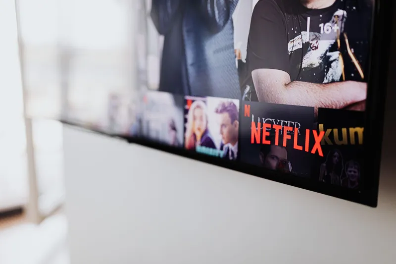
Netflix, for instance, uses its own proprietary subtitle rendering engine. Hulu leans on different defaults. Apple TV+ has its own aesthetic preferences. And then there's the hardware layer — a 4K OLED TV, a laptop screen, a phone, and a projector will each render the same subtitle file with different results. By the time those words reach your eyes, they've passed through a gauntlet of decisions made by designers, engineers, and accessibility teams who may have never coordinated with each other.
The result? One movie, a dozen different reading experiences.
Why There's No Universal Standard (And Probably Never Will Be)
You might assume there's some governing body that sets the rules here. There isn't — at least not one with any real teeth.
The Web Content Accessibility Guidelines (WCAG) offer recommendations for digital text contrast and readability, and the Americans with Disabilities Act has pushed streaming platforms toward better closed captioning standards. But aesthetic subtitle design — the stuff that makes a subtitle feel cinematic versus clunky — exists in a largely unregulated gray zone.
Different platforms have staked out different philosophical territory. Netflix has historically favored a clean white sans-serif font with a semi-transparent black background box, prioritizing legibility over style. Some cinephile-focused platforms and Blu-ray releases prefer a more minimal approach: white text with a thin black outline, no box, designed to feel less intrusive on the image. Others go heavy on the drop shadow, which works beautifully on dark scenes and becomes nearly unreadable against a bright snowy landscape.
None of these approaches is objectively wrong. But none of them is universally right either, which is exactly why your viewing setup and your friend's produce such different results.
The Accessibility Dimension Nobody Talks About Enough
Here's where the conversation gets more serious. For viewers with dyslexia, low vision, or certain processing differences, subtitle font choices aren't a matter of aesthetic preference — they're a matter of whether the film is actually watchable.
Research into accessible typography has consistently shown that certain sans-serif fonts (think along the lines of Arial, Verdana, or purpose-built options like OpenDyslexic) reduce reading friction for many users. High contrast between text and background is critical. And font size matters enormously — what's comfortable on a 65-inch TV in a dark living room is often painfully small on a laptop screen in a bright room.
Streaming platforms have made real strides here. Netflix and Amazon Prime both offer subtitle customization menus that let you adjust font size, color, background opacity, and in some cases the typeface itself. Apple TV+ on Apple hardware gives users fairly granular control through system-level accessibility settings.
But these customization options are buried. Most viewers have never found them. And the defaults — whatever the platform engineers decided looked good on their test screens — become the de facto experience for the vast majority of users.
What Your Subtitle Preferences Might Actually Say About You
Okay, let's have a little fun with this.
If you've never touched your subtitle settings and you're watching on a smart TV with factory defaults, you're probably getting a mid-weight white font with some form of background shading. You're the majority. No judgment.
If you've gone into your settings and cranked up the font size, you've almost certainly experienced the specific frustration of subtitles that eat up a quarter of the screen. You value readability. You've also probably squinted at a bad subtitle on a phone at some point and decided never again.
If you're the kind of viewer who has specifically sought out a platform or Blu-ray release because the subtitles are "cleaner" or "less distracting" — congratulations, you're deep in the cinephile rabbit hole. You care about subtitle design the way a food person cares about plate presentation. The content matters, but so does how it's served.
And if you've ever switched from a streaming version to a different source specifically because the subtitle rendering was better? You're the person this entire article was written for.
What You Can Actually Do About It
The good news is that you have more control than you think — you just have to go looking for it.
On Netflix: Head into your profile settings (not the in-player menu) and look for "Subtitle Appearance." You can change font size, color, drop shadow, and background. It takes about two minutes and can genuinely transform your viewing experience.
On Apple TV+: If you're on Apple hardware, the system-level accessibility settings (under Settings > Accessibility > Subtitles & Captioning) give you control over style across all apps, not just Apple TV+. This is underused and surprisingly powerful.
On physical media: Many Blu-ray players let you adjust subtitle rendering at the hardware level. If you're a home theater person, it's worth digging into your player's settings menu.
Third-party players: If you watch a lot of downloaded or ripped content, applications like VLC or Infuse give you extensive control over subtitle rendering — font, size, color, outline weight, vertical position, everything. This is the power-user route, but it's worth knowing it exists.
The Bottom Line
Subtitles are the invisible infrastructure of world cinema. When they work well, you forget they're there — you're just watching a film. When they don't, you're fighting the text instead of living inside the story.
At AltFilm Bazaar, we think about this stuff so you don't have to — but we also think you should know it exists. Because whether you're watching a Turkish drama, a Japanese horror film, or a French coming-of-age story, the experience you have with those subtitles is a design outcome. It was shaped by choices. And more of those choices are yours to make than most platforms want you to realize.
Spend ten minutes in your settings this week. Your eyes — and your next subtitled film — will thank you.